The News Corp scandal is quickly snowballing as it spreads into different parts of the world, beginning with News of the World in London. In the past weeks, investigators have been analyzing the messy web of interconnections between organizations and key individuals involved with the scandal in order to indict the appropriate entities.
While there is a barrage of news articles providing the latest updates, it can become difficult to keep track of the exact causes and relationships with each new reported event. BusinessWeek and The Wall Street Journal released the following graphics to visually communicate these relationships in an easier-to-grasp form.


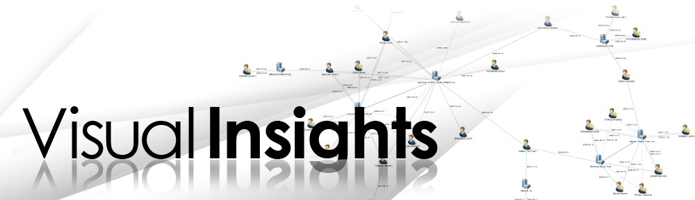
In addition to the News Corp scandal, data visualization can often be used to help people better understand other real world developments that involve very complex subsets of relationships between various entities, such as the Galleon Group’s insider trading case and even finding Osama Bin Laden. Applying social network analysis and centrality measures can show who communicates with whom, how often, and how entities are tied together. This helps to reveal varying levels of influence of certain people or organizations that can provide critical actionable insights. Even if there are prominent perpetrators at the forefront of scandals, “hidden” individuals outside the immediate circle of their networks may interestingly come into question due to high centrality measures.
